

.png)
In February 2022, when catastrophic flooding hit Lismore, New South Wales, emergency services recorded over 3,000 calls for help in just 48 hours. Despite comprehensive flood risk documentation being publicly available for years.
The problem isn't a lack of information. It is how that information is communicated.
The Documentation Trap: When More Information Creates Less Understanding
Across Australia, local councils, emergency management agencies, and water authorities have invested millions in flood risk assessments, mitigation strategies, and public information campaigns. The resulting outputs are technically accurate, comprehensive, and almost universally ineffective at reaching the people who need them most.
The assumption is that informed communities are prepared communities. But this linear model from data to document to public awareness breaks down at the critical last step.
Consider the average flood information fact sheet. It contains flood level statistics, catchment area descriptions, historical event timelines, and evacuation protocol instructions. It's accurate. It's thorough. And it requires residents to translate abstract concepts—"the 1-in-100-year flood plain," "4.2 metres above habitable floor level"—into personal risk assessments.
This is cognitive work most people cannot or will not do, especially under stress. When floodwaters are rising, no one opens a PDF to read about catchment hydrology. They need to know one thing immediately:
What does this mean for me, right now, in my house?
Visualisation Over Documentation: A Fundamental Shift
The solution isn't to simplify the information, it's to transform how we deliver it. Effective flood communication must move from document-centric to visualisation-first approaches that prioritise immediate comprehension over comprehensive detail.
Visualisation-first communication operates on three core principles:
1. Show, don't describe. A 3D rendering of water flowing through a neighbourhood conveys risk in seconds. A written description of the same scenario requires minutes to read and active mental effort to visualise. NSW State Emergency Service needed to communicate flood risk across the Northern Rivers region so we produced animations showing water moving through actual catchments. Residents could see their area, recognise landmarks, and instantly understand how floods develop. No translation required.
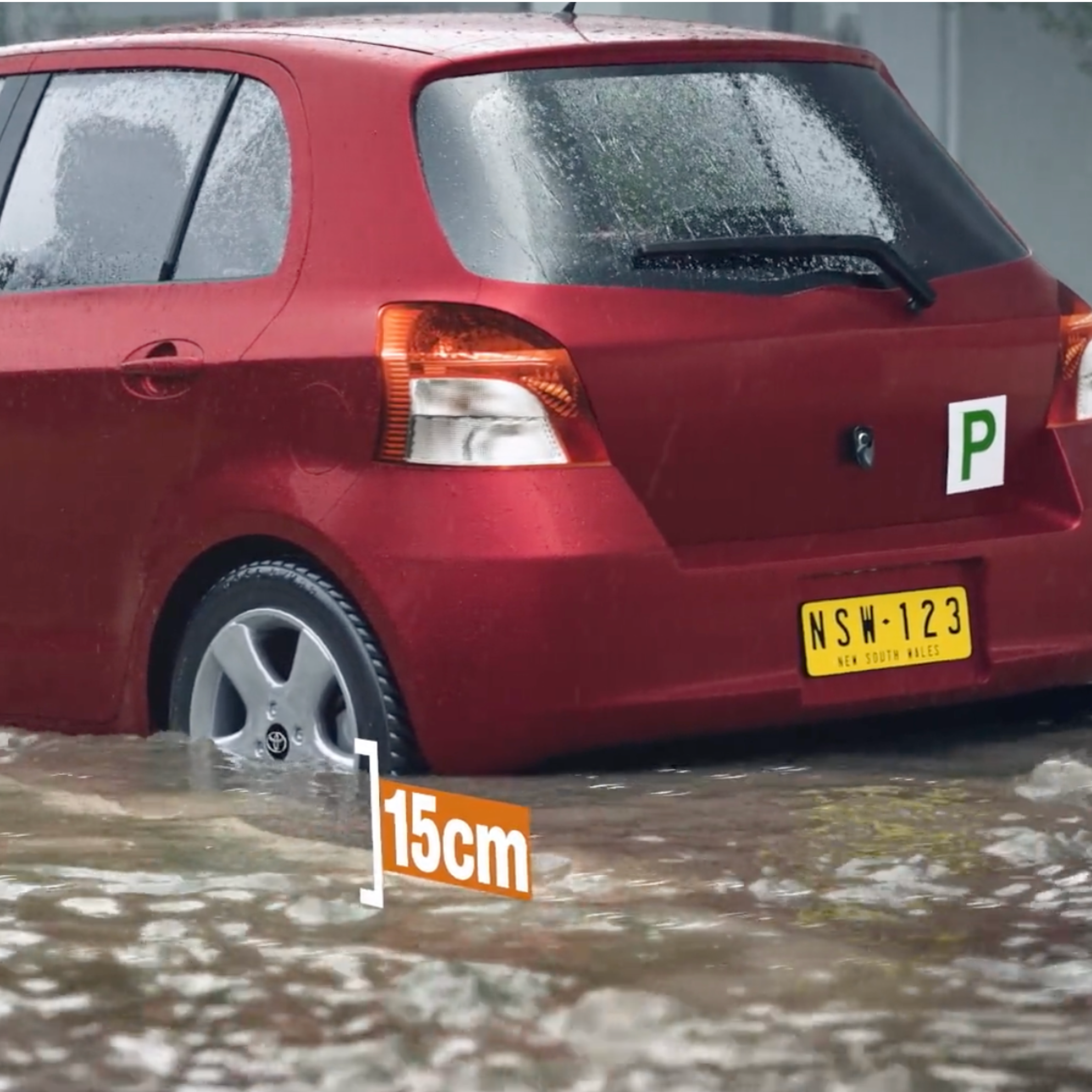
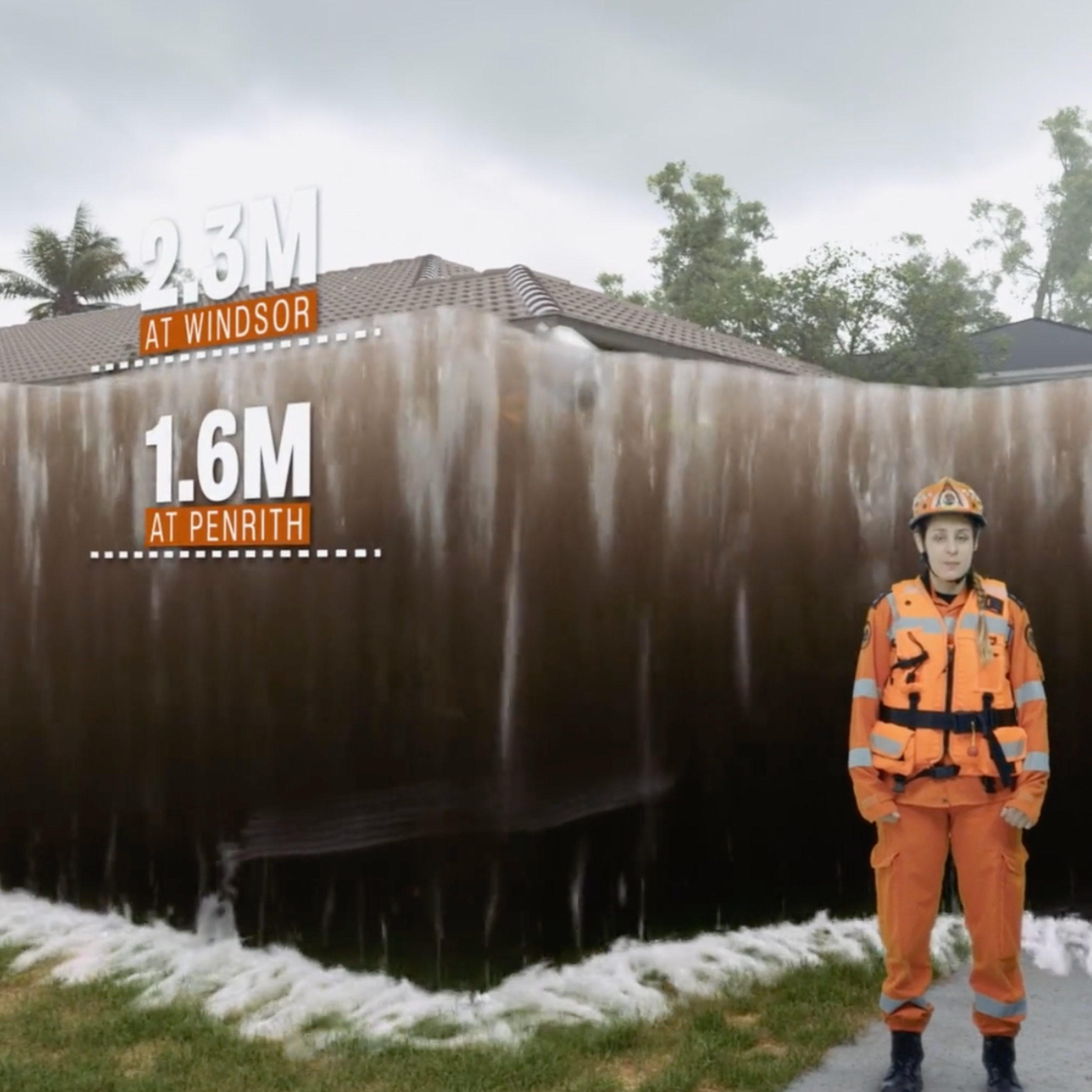
2. Make it personal and proximate. Generic information creates psychological distance. People struggle to connect "flood zone maps" to their daily lives but utilising visual concepts like the bathtub effect here cuts through to viewers. Show someone their street, their home, their regular driving route under flood conditions, and the information becomes visceral and actionable. The risk and understanding of floods is clearly apparent in video format like this example for NSW.
Interactive web portals like Fredericton for example that allow residents to explore flood scenarios specific to their location transform passive information consumption into active engagement.
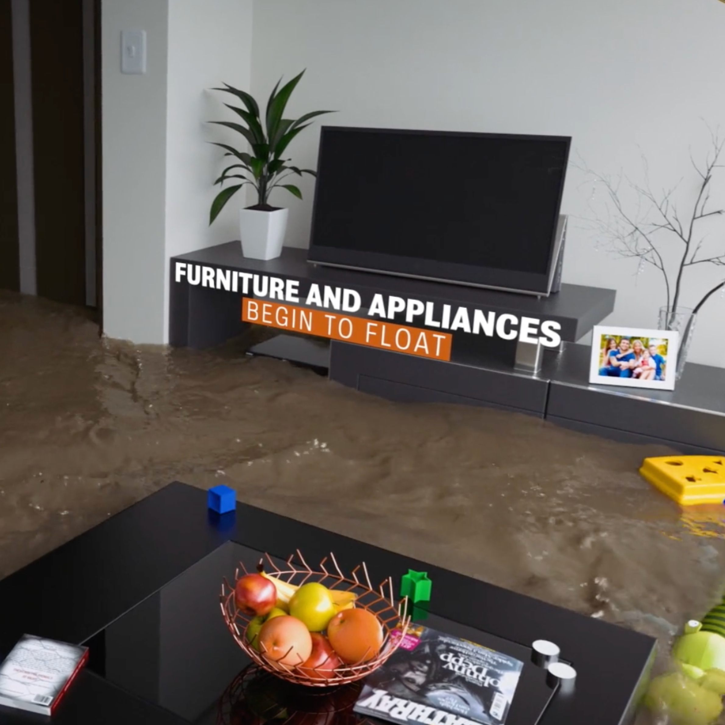
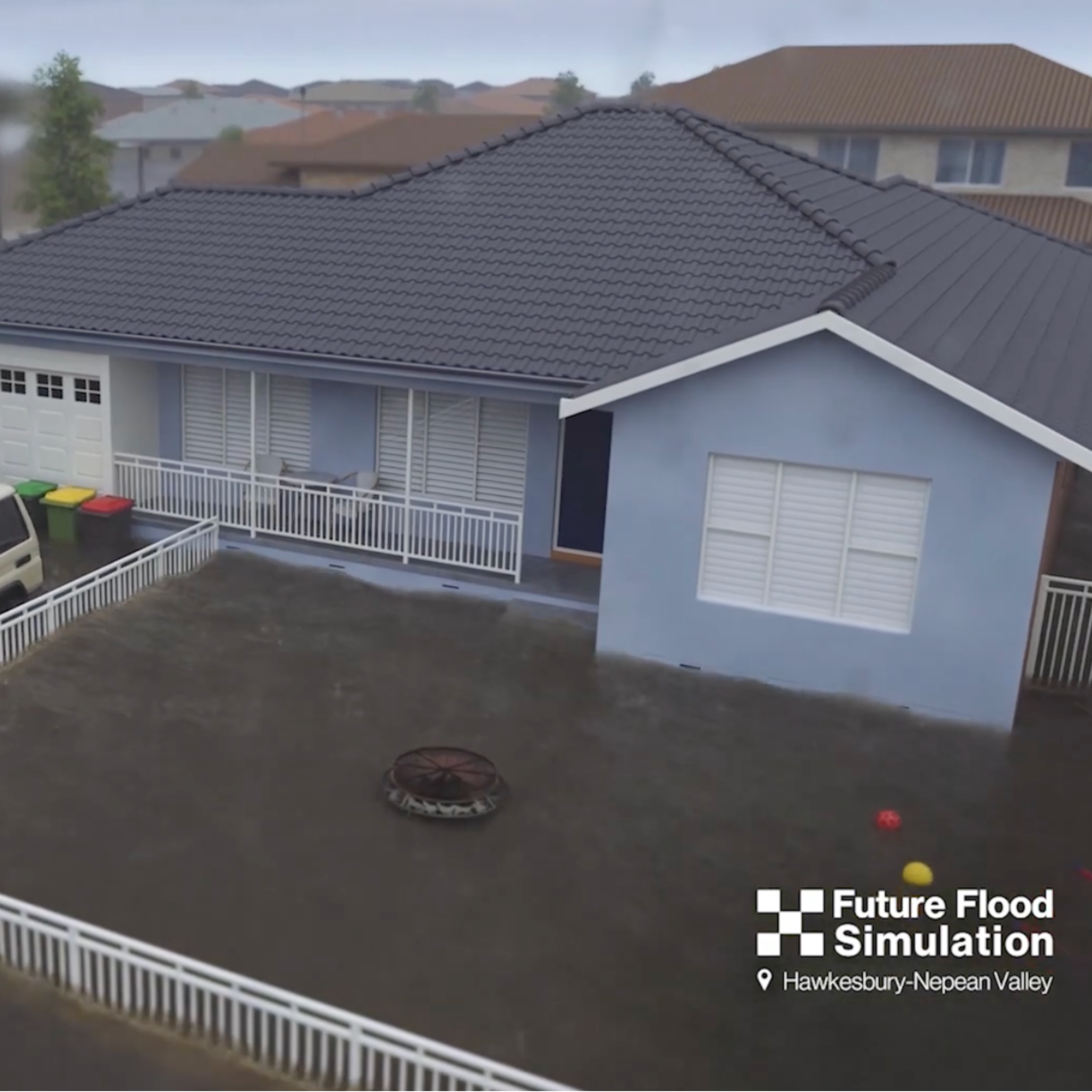
3. Prioritise emotional resonance alongside technical accuracy. Flood preparedness requires behavioural change, and behaviour change requires emotional engagement. When we worked with NSW SES on the Future Flood project, we modelled 3D animations using real properties and possessions—actual cars in driveways, familiar furniture in living rooms—then showed residents' genuine reactions to seeing their homes inundated. The resulting video was featured across major news networks not because it was technically novel, but because it made flood risk emotionally real in a way no statistic could.
Evidence from the Field: What Works
The effectiveness of visualisation-first approaches becomes clear when comparing engagement metrics. Traditional flood fact sheets, when tracked, show average engagement times of under 30 seconds, barely enough to skim a header. Video content explaining the same concepts sees completion rates above 70%, with average viewing times of 2-3 minutes.
More importantly, comprehension improves. When Reconstruction NSW needed to communicate flood evacuation routes across multiple scenarios, we created videos using 3D renders to walk viewers through each route visually.
The Victorian Murray Floodplan Restoration Project demonstrated another critical advantage of visualisation platforms: they create a centralised hub for ongoing engagement when flooding is necessary. Rather than scattering information across fact sheets, press releases, and committee minutes, the project's web portal combines video explainers, interactive maps, and accessible documentation in one location. Community members can explore at their own pace, returning as questions arise. This is particularly valuable for complex, multi-year infrastructure projects where understanding develops incrementally.
Similarly, when City West Water needed to communicate the staged rollout of the Lonsdale Street Sewer Upgrade, traditional project timelines and maps created confusion about when specific neighbourhoods would be affected. 3D visualisations showing each construction phase in sequence, with recognisable landmarks and street names, allowed residents to pinpoint exactly when and how they'd be impacted.
Overcoming Common Objections
When we advocate for visualisation-first approaches, we encounter predictable resistance. The concerns are worth addressing directly:
The Path Forward: Institutionalising Visual Communication
For visualisation-first flood communication to become standard practice rather than exceptional effort, several systemic changes are needed:
Embed visualisation requirements in project scoping. Flood mitigation and infrastructure projects should include public communication deliverables specifically visual communication deliverables in initial budgets and timelines, not as afterthoughts. Procurement processes should evaluate communication strategies alongside engineering solutions.
Build platforms for ongoing dialogue. One-time information campaigns have limited impact. Flood preparedness requires sustained engagement. Web portals that aggregate visual resources, allow community questions, and update as projects evolve create lasting touchpoints. Lismore City Council road and flood restoration portal, which provides ongoing project status updates through visual timelines and interactive maps, demonstrates how digital platforms can maintain community connection through multi-year recovery efforts.
Information Is Not Communication
The gap between having information and communicating effectively is where flood preparedness efforts often fail. We produce comprehensive data, rigorous analysis, and detailed documentation, then wonder why communities remain unprepared.
The answer is that information transfer and communication are fundamentally different activities. Information transfer moves data from one location to another—from flood model to report, from report to fact sheet, from fact sheet to website. Communication creates shared understanding between people. It accounts for how humans process information under stress, how we assess risk, what motivates us to act.
Visualisation-first approaches recognise this distinction. They prioritise comprehension over comprehensiveness, emotional engagement over exhaustive detail, and immediate clarity over technical precision. This isn't a rejection of rigorous analysis it's recognition that the same information must be communicated differently to different audiences for different purposes.
As climate change intensifies flood risk across Australia and globally, the stakes for effective communication will only rise. The communities that thrive will be those that move beyond documentation as the default mode of public engagement and embrace visualisation as the foundation of flood literacy.
When the next flood or other disaster event occurs, the measure of our success won't be how many reports we produced. It will be whether residents knew what to do, when to do it, and had the understanding necessary to act. That requires more than information. It requires communication designed for the reality of crisis: fast, visual, personal, and impossible to misunderstand.
The tools exist. The evidence is clear. What's needed now is institutional commitment to communication that matches the urgency and complexity of the challenge we face.
To discuss how visualisation-first communication can support your organisation or project, contact us at contact@spatialmedia.io

